Loved by Top Founders

Design Systems and Style Guides Services for Scalable Product Design

We build design systems and style guides that help teams stay consistent, move faster, and scale interfaces without redesigning from zero every time.

✦Reusable UI component systems
✦Brand-aligned style documentation
✦Scalable product design foundations
trusted by the world’s top brands
Recent Work

Design Systems Portfolio

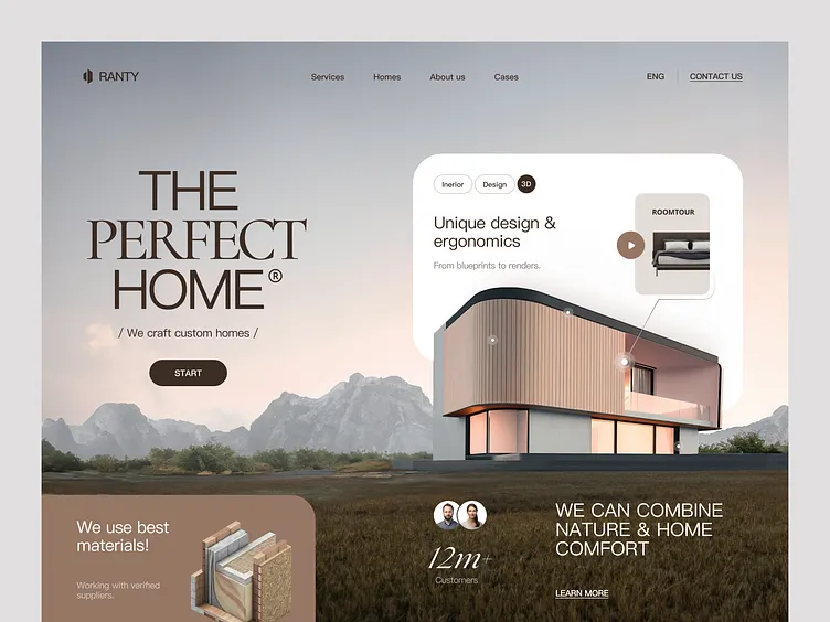
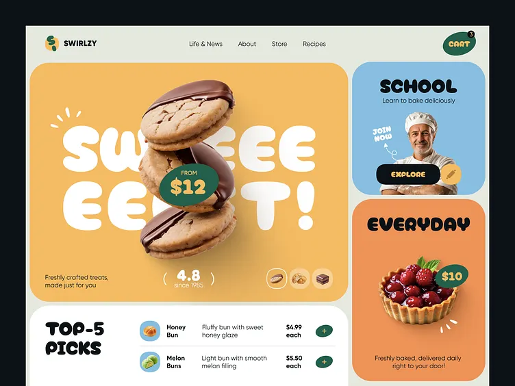
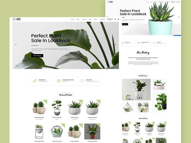
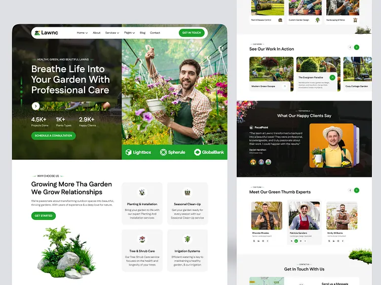
See design systems and style guides created for product teams, websites, and growing digital brands.

Is Inconsistent Design Slowing Your Product Team Down?

Without a system, every new page or feature becomes a reinvention problem. Design systems create shared rules that keep work consistent and faster.

✔UI components look different across pages
✔Designers and developers lack shared rules
✔New features take longer than they should
✔Brand and product visuals drift over time
✔No documented style foundation for scaling
System Design Solutions

Design Systems and Style Guides Built for Consistency and Speed

We create systems that help teams design and build more consistently across websites and digital products.

01

UI Component Systems

Reusable interface components designed for consistency across pages, features, and product areas.

02

Visual Style Guides

Documented rules for typography, color, spacing, and visual language that keep design aligned.

03

Pattern Libraries

Reusable layout and interaction patterns that reduce decision fatigue on future projects.

04

Product Design Foundations

System foundations for growing products that need scalable structure and clearer design rules.

05

Brand-to-Product Alignment

Style systems that connect brand identity with practical product interface needs.

06

Documentation for Teams

Clear documentation so designers, product managers, and developers can use the system consistently.

07

Design System Expansion Support

Support for growing systems as new components, pages, and product needs appear.

08

Implementation-Friendly Delivery

Organized system files prepared for practical team adoption and ongoing use.

Design System Pricing

Design Systems and Style Guide Packages

Clear packages for teams that need scalable design foundations without vague deliverables.

Starter Style System

Best for brands that need a practical style guide and core visual rules.

$299

$599/

✔Core style guide
✔Typography and color system
✔Basic component direction
✔Documentation package
✔2 revision rounds

Growth Design System

Best for product and website teams that need reusable components and stronger consistency.

$699

$1,399/

✔UI component system
✔Pattern library support
✔Dedicated system designer
✔Team documentation
✔Unlimited revisions on selected system areas

Premium Design System Kit

Best for growing product teams that need a fuller system foundation for scale.

$1,199

$2,399/

✔Expanded component system
✔Senior design direction
✔Brand-to-product alignment
✔Implementation-friendly documentation
✔Priority delivery
Best Value

All-In-One Design System Package

Complete system support for teams that need style guides, reusable components, documentation, and scalable design foundations.

Most Complete Option

$1,699

$3,399/

Core System
✔Style guide foundations
✔UI component systems
✔Pattern libraries
Team Enablement
✔Documentation for designers and developers
✔Implementation-friendly structure
✔Consistency rules
Process
✔Dedicated system designer
✔Clear review stages
✔Reliable delivery timeline
Outcomes
✔Stronger consistency
✔Faster future design work
✔Scalable product foundations

Why Teams Choose Our Design Systems and Style Guides

We build systems for real team use, not documentation that sits unused.

Consistency at Scale

Shared components and rules help products stay coherent as they grow.

Reusable systems reduce the need to redesign basic elements from scratch.

Designers, product managers, and developers can work from the same foundation.

Systems are delivered in a form teams can actually use day to day.

Higher packages support growth as new product needs and components appear.

Need a Design System That Makes Scaling Easier?

Get design systems and style guides built for consistency, speed, and practical team adoption.

What makes us different

Everything Your all-in-one design pro

Build a clear, memorable identity that strengthens trust, improves visibility, and helps your business stand out in your industry. Build a clear, memorable identity that strengthens trust, improves visibility, and helps your business stand out in your industry.

Best UX/UI Agencies for SME and Enterprise brands globally

Top 1 Graphic Design
Companies 2025

Recent Work

Award-winning design across every category

+ More Services

Web Design

Logos

Slide decks

Branding

Social media

UI/UX design

Website development

eBooks

Print design

Email

Display ads

Icons

Brand guides

+ more

All the things you need
under one roof.

Our Process

How Design System Development Works

From current product patterns to a usable system foundation.

01

Audit and Pattern Review

We review existing interfaces, brand rules, and consistency gaps before system design begins.

02

Foundation Definition

Core visual rules, components, and system structure are defined for team use.

03

System Build

Components, patterns, and documentation are developed into a usable system.

04

Team Delivery

Organized system files and guidance are delivered for practical adoption.

Strong Design Systems Reduce Chaos as Products Grow

Teams move faster when design decisions are already defined and shared.

faqs

Got questions? We've got straight answers.

Do you build full design systems or only style guides?

Both. Packages range from practical style guides to fuller component systems.

Yes. Systems can be structured for website, product, or combined digital environments.

Yes. Documentation is included so teams can use the system consistently.

Most projects take 2 to 5 weeks depending on system depth and product complexity.

Yes. Higher packages and follow-on work support expansion as product needs grow.

Design Systems Built for Consistency, Speed, and Scale

From style guides to fuller component systems, we help teams design and build with shared rules that last.

Scroll to Top